Oliver Brothers Custom Framing in the news » Framing Art On a Napkin
Framing Art On a Napkin
Picture Framing Magazine
May 2013
by Mira Bishop
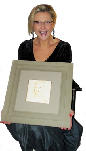 A challenging custom frame for
a decades-old delicate artwork
required both good design and
cutting-edge construction
While sitting in a restaurant in 1979, a 19-year-old woman received a napkin with her hand-drawn portrait from a young man. Surprised and flattered, she asked for the young artist’s signature. Instead, he wrote his phone number! Though she never called, the woman still chose to preserve the image and later discovered that the artist graduated from the Academy of Fine Arts in Belgrade, Yugoslavia.
The subject of the portrait was me, and the napkin—a medium never intended to be preserved long term—faded greatly over the years and the paper became thin and wispy. Although I am now the head of custom framing for Oliver Brothers, an art restoration and conservation firm in Beverly, MA, only recently did I decide to frame the napkin.
Design
The design for framing a decades-old drawing on a napkin
involved floating one acrylic frame inside another— a special challenge
because the weight the frames required a solution beyond bonding with adhesives.
This was a unique and challenging custom framing design. The napkin is fragile, and the drawing has faded. I had to frame it so it would look special but still maintain the artwork as a focal point. Inspired by the history of innovation at Oliver Brothers, which invented the first vacuum press for re-lining paintings in 1933, I worked with Prisma Frames (Bella Moulding) to devise a cutting-edge method for floating two seamless acrylic frames.
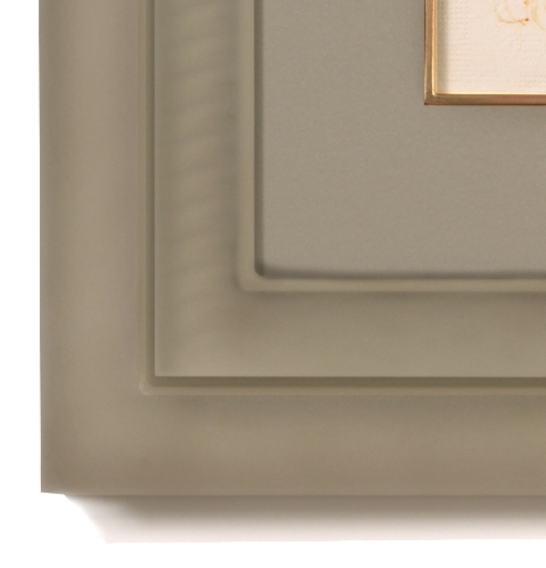
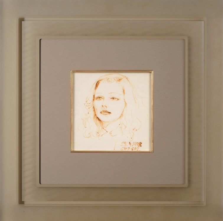
The outside floater frame is solid sawdust in color, while the inner frame contains a barely visible pattern of the same color. Both frames are adhered together through solid acrylic backing plates. A wide Crescent museum rag mat completes the monochromatic design, with a seamless gilded moon-gold fillet adding a sophisticated classical appeal. The napkin itself is hinged to a Crescent Museum Framing Art on a Napkin rag mat substrate, and the overall piece is glazed with Optium Museum Acrylic for maximum clarity and UV protection.
The result is a minimalistic contemporary design that leaves the artwork as the undeniable focal point. Two Prisma frames offer an architectural gravitas that pays homage to more conventional layered framing. The airiness of the acrylic, however, softens the overall feeling of the piece, allowing for a larger frame and mat while also highlighting the smoky delicacy of the image. Finally, a slight reddish rub was applied to the fillet to complement similar tones in the portrait’s ink, which has begun to oxidize with age. The combination of frames, mat, and fillet present clean lines that invite the viewer to linger without being distracted, ultimately drawing the eye to the image at the center.
In designing a framing solution for the napkin, I had two goals: The focal point of the artwork should dominate the overall design and the frame design should lend importance to the small artwork and make it stand out. The concept was to layer several components around the artwork while using color as tool to control their dominance. As objects get farther away, the colors start to blend and loose their intensity. By selecting the same warm gray color for all framing components but the fillet, the frame achieves a perception of non-dominance for both frames and the matboard. To bring all of the design elements into agreement and subconsciously bringing the viewer’s eye in towards the center, a gilded fillet was added. The addition of the fillet added a luxurious feel to the mat without creating an overbearing look.
To avoid creating a chaotic or lifeless design, it was important to find an appropriate proportional balance for all the elements in the frame. This was a critical stage of the design, which made it necessary to experiment without rushing. For this frame, the most important element in achieving design unity was the fillet. Correctly selecting the appropriate width and the precise shade of gold was critical.
Frame Construction
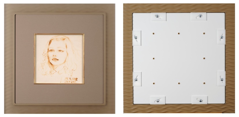
The artwork was hinged to rag mat and surrounded by the fillet and a
4-ply rag mat (left) before being mounted to the inner frame with fitting
shims that insert into a rabbet V-groove
The idea of attaching two acrylic frames together had never been done before. Because of that, I had to be in contact almost on a daily basis for most of a month with the Prisma production staff, exchanging ideas and receiving progress reports on how they could attach an acrylic floater frame to a main acrylic frame. This required testing different ways of floating a regular Prisma frame in a Prisma floater frame. Testing was critical to ensure the structural stability of the frame while respecting the design concept and maintaining the beauty of seamless acrylic frame. At a midpoint in the design process, I suggested creatinga backing for the floater frame and connecting it to the
backing of the regular frame. To realize my vision, the Bella Moulding staff had to step up to the plate and make the concept a reality. Mark Lebeau, manager of sales and operations for Bella Moulding/Prisma Frames, says, “The basic idea was to stack a Prisma custom frame inside of our Prisma custom floater frame. We attempted to work with a couple of different adhesives, but given the weight of the acrylic, the tests failed. We came to discover a custom backing system inspired by the backing system of standard Prisma custom frames. This is how we were able to attach the frames to one another.”
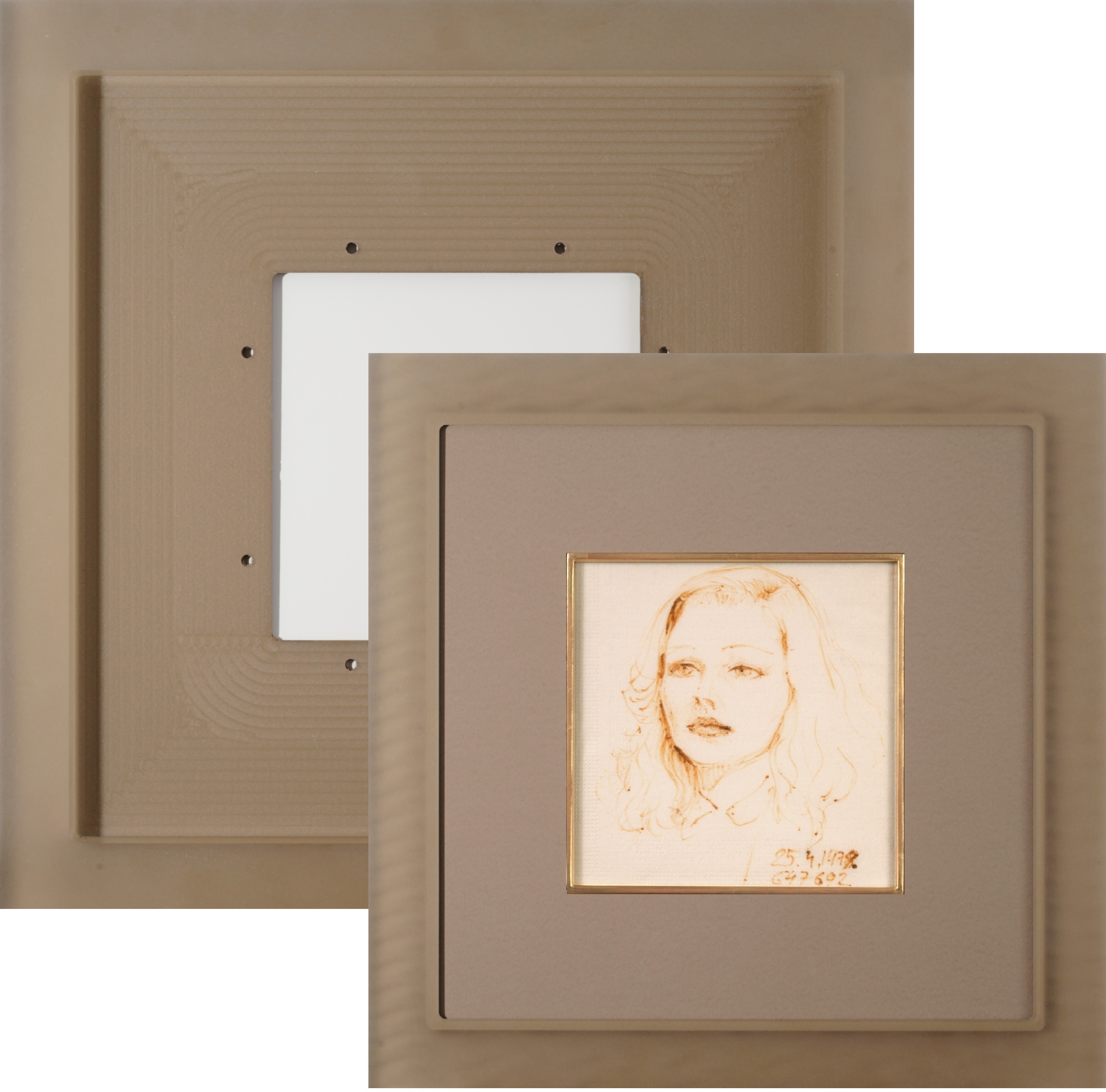
Joining the outer float frame (rear) to the inner frame (front) was done
by attaching special acrylic backing sheets to each frame.
Fillet
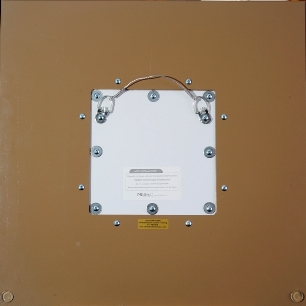
Once the frame construction was solved, the fillet was custom milled, joined, and then hand-gilded. The visible width of the fillet is ¼”. The fillet’s soft edges around the artwork bring even more attention to the focal point, with the slightly rounded corners mimicking the inside lines of both acrylic frames. For the fillet to truly enhance the design concept, selecting gold leaf with an appropriate degree of intensity, purity, and brilliance was important. The color and texture of gold leaf is typically unexpected next to acrylic, but the fillet added a subtle contrast and additional interest to the composition. Moon gold was used because its reddish shade worked the best with the artwork and the frame. To further eliminate brassiness and intensify the red color, a red rub was applied. Controlling and reducing the shine was then achieved through light antiquing. Gilding a seamless fillet and achieving an exact shade to complement the artwork, frame, and matboard took some time and experimentation, but the results were worth the effort. The mounting hardware was attached to the outer frame acrylic backing through a window cut in the floater frame backing.
Assembly
The mounting hardware was attached to the outer frame acrylic
backing through a window cut in the floater frame backing.
The fillet, which is a perfect square, was cut and joined very precisely. This made cutting a reverse bevel, 4-ply Crescent rag mat quite easy. The fillet was separated from the rest of materials with Lineco metal tape. This small detail is quite important because metal tape will stop acid migrating from the wood of the fillet into the matboard and eventually the artwork. The artwork was then attached to 4-ply Crescent Museum rag matboard with two Japanese paper hinges ¼”x½” and wheat starch paste. Optium Museum Acrylic was used for glazing, and there was no need (or space) to add a backing as the Prisma frames formed a firm acrylic enclosure.
The Result
This design ended up winning a first place “Best in Show” award in Tru Vue’s national custom framing design contest, Champions of Conservation, at the West Coast Art & Frame Expo in Las Vegas this past January. The artwork’s personal significance to me and my passion for creative design will hopefully be an inspiration for others in the industry who want to blend good design principles with creativity. ■
MAIN WEBSITE: https://www.OliverBrothersOnline.com
Oliver Brothers Custom Framing 117 Elliott Street, Beverly, MA 01915 617.536.2323


